BRANDING·IDENTITY SYSTEM

Route of Condor
Identity for an expedition documentary studio.
BRAND STRATEGY
NAMING
VISUAL IDENTITY
TYPE SYSTEM
LOGO MOTION
WEB DESIGN
EDITORIAL (MARCA MAGAZINE)
SCROLL ↓
Identity for an expedition documentary studio.
Two mountain ridgelines that, together, form the wings of a condor.
The name is the route we document: real expeditions, filmed in the field. The mark is born from that idea — quiet, editorial, unadorned — and works as a signature on a printed cover as well as in a video frame.
How we built the brand.
INK ON BONE
BONE ON INK
MONOCHROME / LINE
Clear space — the dotted margin marks the minimum free area around the mark in any application.
Two mountain ridgelines facing each other. Seen together, they draw the open wings of a condor.
Each ridgeline is traced as a wing: mountain lines, sharp breaks, no extra curves.
The two ridgelines join into a simple teardrop body — the point where the route we document is born.
The result: a condor made of mountain. The official Route of Condor mark.
One studio, one route.
Headline in italic Cormorant Garamond over a deck in Inter — the studio's editorial voice in two weights.
IDENTITY IN MOTION
The identity breathes too: the same mark, drawn as a blueprint, on a silent loop.
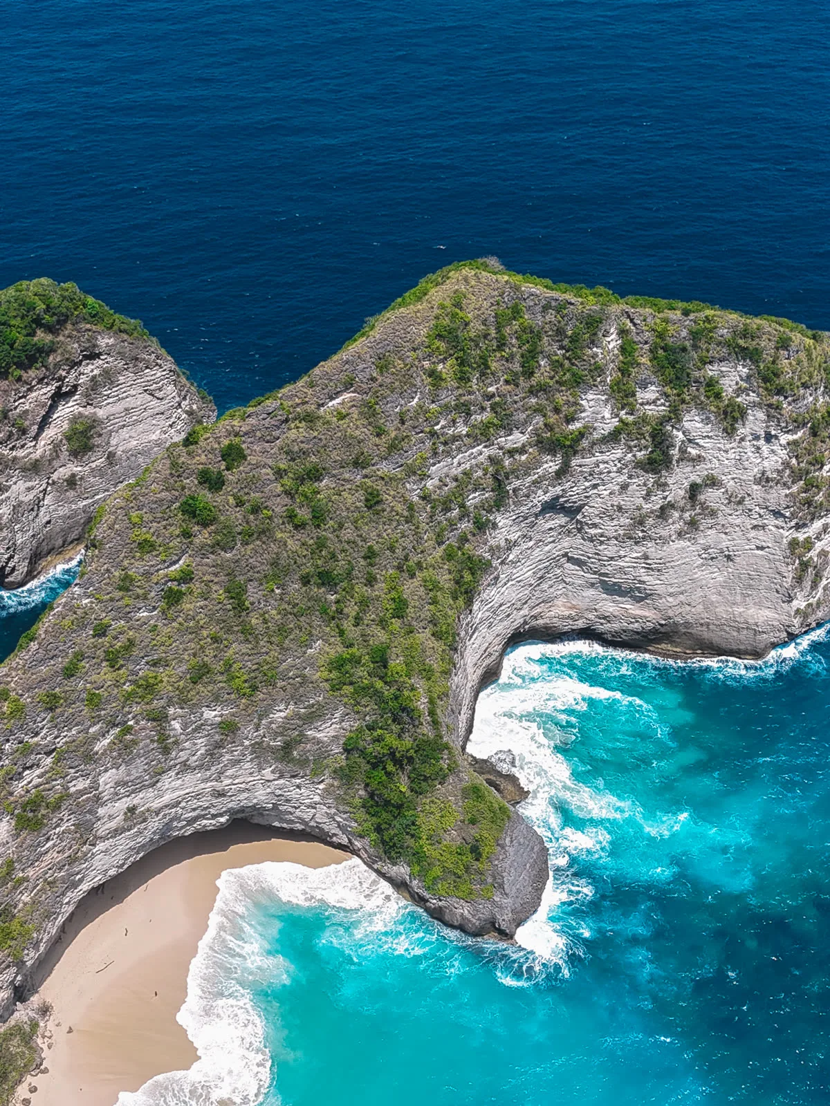
MARCA cover — the studio's printed editorial piece.
PRODUCT / INTERIORS



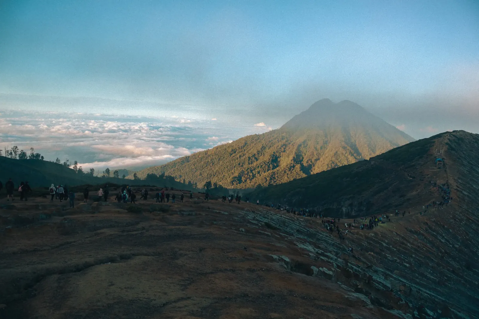
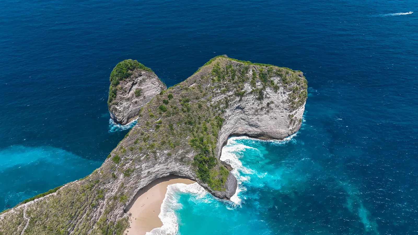
Identity — Route of Condor
Does your brand deserve a system like this? → routeofcondor.com/en/services/
Brand direction — Route of Condor Studio